5 Great Tips For Your Best Company Colours
The importance of Colour
Colour is more important to your business than you might think. If you get it right you can influence your customers positively but if you get it wrong your business will suffer as you give out the wrong message to the wider world about your brand. The colours you use can significantly influence potential customers when they judge you, your company and your product. Apparently almost 85% of consumers claim the colour was the primary reason why they bought a particular product. In the case of Heinz they made an extra $23m by changing the colour of their ketchup, but more on that later. Colour can also help create the story about your brand. If someone has no prior knowledge of your business the colour and design of your logo will influence their perception of your brand. Changing the colour alone can also change the brand personality.

Colours tend to have meanings. In nature red, black and yellow are understood as warning signs of danger. Examples being the garden wasp or the venomous Coral Snake as shown below.


For a little more information on the use of colour I have another video from Jane Chrumka. It is relative short and may help you if you are planning on using colour in your business or home.
Colour is more important to your business than you might think. If you get it right you can influence your customers positively but if you get it wrong your business will suffer as you give out the wrong message to the wider world about your brand. The colours you use can significantly influence potential customers when they judge you, your company and your product. Apparently almost 85% of consumers claim the colour was the primary reason why they bought a particular product. In the case of Heinz they made an extra $23m by changing the colour of their ketchup, but more on that later. Colour can also help create the story about your brand. If someone has no prior knowledge of your business the colour and design of your logo will influence their perception of your brand. Changing the colour alone can also change the brand personality.
With the importance of colour in mind I spoke to
interior designer and colour consultant Jane Chrumka from Harmony Ridge Interior
Designers Edinburgh and asked her to share a few tips on how anyone could use colour
more effectively in business.
Jane’s 5 Top Tips
One. Be an individual and apply design and colour specifically for you and your requirements. For example, if you are exhibiting pick out your dominant corporate colour and use it as an accent to draw attention to your stand.
Colour is a powerful and effective communication tool and
when used well and wisely it can draw attention to you or your company for all
the right reasons. Jane’s five top tips for colour in business are:
One. Be an individual and apply design and colour specifically for you and your requirements. For example, if you are exhibiting pick out your dominant corporate colour and use it as an accent to draw attention to your stand.
Two. When mixing colours decide whether you are using a cool
or a warm colour pallet, for best results stick to one. Mix with purpose if you
are going to do so.
Three. When presenting yourself, for example in a meeting or networking or presentations, think about your wardrobe style and colour. Present to each occasion and with your audience in mind.
Three. When presenting yourself, for example in a meeting or networking or presentations, think about your wardrobe style and colour. Present to each occasion and with your audience in mind.
Four. Check your intended message is being supported by your
colour choices.
Five. Have fun and explore with colour. Seek professional
advice if you need it.
Men and Woman are Different
When it comes to personal colour preference blues and greens
generally lead the way since these are often our favourite colours. However the
favourite colours of men and women do differ so you would be wise to consider
which gender you are targeting.
A study by Joe Hallock using 232 respondents from 22
countries revealed these differences quite nicely. Overwhelmingly for men the most popular
colour was blue with 57% citing it as their favourite, with black next at just
9%. For women blue was also the most popular but at a lower figure of only 35%
of respondents, with purple next at 23%. Interestingly NO men cited purple as a
favourite colour.
 |
| Favourite Colours by gender |
The safe takeaway from the data would be choose blues and
greens if you are targeting both men and women but if you are after a male audience
make sure you avoid purple.
The Genders Respond Differently to
Colours
The genders not only have different favourites but also respond
differently to colour stimuli. An interesting example being research on whether
the colour of clothing changes how sexually appealing someone appears. Psychologist
Andrew J. Elliot found that men were significantly more romantically attracted to
women who dressed in red compared to any other colour. However for women the
colour of a man’s clothing did not alter his attractiveness. An interesting result
since in nature the displays of colourful males feature in courtship rituals.
Colours have meanings
Colours tend to have meanings. In nature red, black and yellow are understood as warning signs of danger. Examples being the garden wasp or the venomous Coral Snake as shown below.

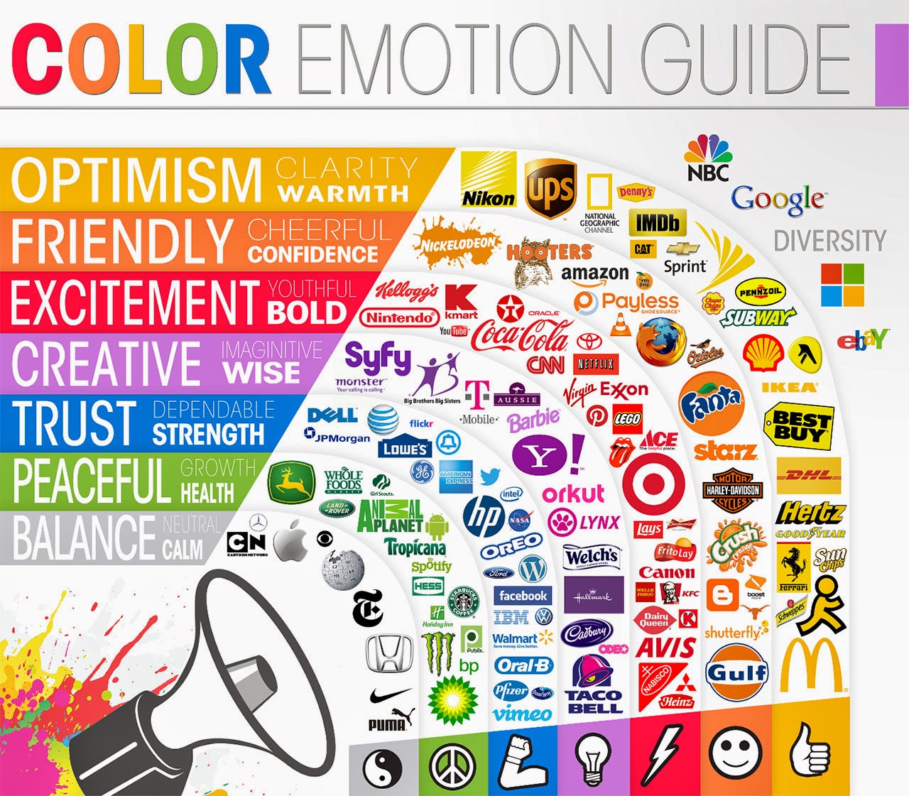
In our own world colour meanings and emotions are extensively used in logo design and
branding. Reds tend to excite us while blues and greens are more relaxing. The graphic
below gives some of those meanings although details can vary country to country.
The next infographic from The Logo Company shows some useful examples on the emotions of colours and how they can and have been used.
Be Careful With Your Colour Palate
Pay attention to your industry’s standard colour schemes. If
you try something completely weird your customers may become confused or your
choice is initially a runaway success stop and understand why that maybe.
Take the
example of Heinz EZ Squirt – A ketchup released in the US initially in Blastin
Green to tie-in to the first Shrek film. Kids loved it so Heinz launched
further colours of EZ Squirt such as Funky Purple, Stellar Blue, Passion Pink, Awesome Orange,
and Totally Teal. Sales soared capturing 60% of the US ketchup market and making an extra $23m for Heinz, however within
five years EZ Squirt was off supermarket shelves due to falling sales.
The trouble was EZ
Squirt was a novelty product with much of its success down to children’s
affection for the Shrek movie. Once Shrek mania faded the reality of colour
psychology came back into play and consequently EZ Squirt sales also faded. It’s not
really surprising since children don’t like the colour green because that’s the
colour of their least favourite food, vegetables. For certain products there is
a “right” colour and for millions of consumers ketchup is not green. According
to Nigel Hemmington, head of Bournemouth University's School of Service
Industries "When something doesn't look the colour we expect, it changes
our perception of how it tastes.”
Colour and Conversion Rates
If you are using your website or online video to sell a digital product (ebook, video training course, knitting patterns, etc.) you
can exploit colour to help boost your conversion rates.
For your onscreen Call To Actions (CTAs) choose colours that
strongly contrast with the rest of your page's colour palate. The CTA button will stand
out, attracts the eye of the viewer/visitor and conveys the obvious “Click Me” message. By using that bold colour you are guiding your
customer in the direction you want them to go.
If you have the
opportunity you should do an A/B test to ascertain the best colour to use. Perhaps
you might not like the button colour the data tells you is the best but if that
is the one people are clicking the figures cannot be wrong.
More on Colour & Interior Design
More on Colour & Interior Design
For a BBC article on colour psychology related to home decoration
click here.
For a Wikipedia article on the psychology of colour clickhere.